
A new way to look at Ann Arbor: Race-based map shows where ethnicities congregate
Dustin Cable's Racial Dot Map zoomed in to include Ann Arbor and Ypsilanti
Racial Dot Map Screenshot
When the map is zoomed out to include most of the Lower Peninsula, Ann Arbor looks to be a pleasantly purplish dot. While other Michigan cities such as Detroit, Flint and Saginaw show sharp Black/White concentrations in different areas, Ann Arbor’s demographics appear to be far more mixed.
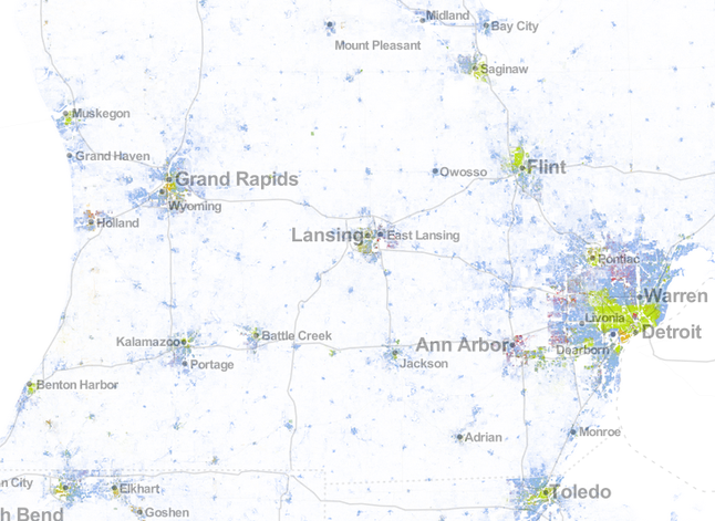
Large cities across Michigan show stark segregation especially between "green" areas representing solidly Black neighborhoods and "blue" regions representing the White population.
Racial Dot Map Screenshot
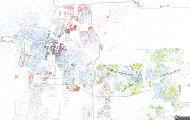
Zooming in reveals stronger racial delineation, with nearly solid “red” clusters of Asian residents appearing in Northeast and downtown Ann Arbor. While few areas of town appear extremely segregated, certain pockets display more solid color schemes.
One neighborhood that stands out for its diversity is the neighborhood just south of I-94 surrounding Bryant Elementary School. Dots of green, blue, red and orange overlap so impressively that it would be difficult for a naked eye to determine a majority.
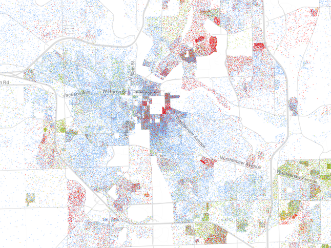
A closer look at Ann Arbor reveals that some neighborhoods segregate somewhat definitively by race while others are more integrated.
Racial Dot Map Screenshot
According to the Atlantic, Cable modeled his map on a previous MIT project that plotted population density with black dots on a white map. Cable took the project to the next level by adding color (both literal and figurative) to our perception of where we live and who we live with.
Ben Freed covers business for AnnArbor.com. You can sign up here to receive Business Review updates every week. Get in touch with Ben at 734-623-2528 or email him at benfreed@annarbor.com. Follow him on twitter @BFreedinA2
Comments
Mike
Fri, Aug 16, 2013 : 10:53 p.m.
Where's the crime incident overlay. We want data!
DJBudSonic
Fri, Aug 16, 2013 : 10:46 p.m.
Reminds me of Florence Kelley's Slums of the Great Cities Survey Maps, conducted in the neighborhoods surrounding Jane Addams Hull House in Chicago. Now, if I can just find those clusters of white dots...they must be on here somewhere....
nekm1
Fri, Aug 16, 2013 : 5:32 p.m.
Just like animals do in the wild. go figure
Basic Bob
Fri, Aug 16, 2013 : 10:05 p.m.
You don't see too many poodles or shih tzus in the wild.
John
Fri, Aug 16, 2013 : 7:23 p.m.
So, what neighborhood in the wild is the mosquito neighborhood then? I'm not fond of mosquitos.
Westfringe
Fri, Aug 16, 2013 : 5 p.m.
Oh great, here comes some more forced diversity. I love government social engineering!
Basic Bob
Fri, Aug 16, 2013 : 10:04 p.m.
That's not the government who engineered those racial patterns. People engineered that all on their own.
IjustWorkHere
Fri, Aug 16, 2013 : 7:25 p.m.
Charley Sulivan, read and you will see where forced diversity will come from. http://www.foxnews.com/politics/2013/08/08/obama-administration-using-housing-department-to-compel-diversity-in/
Charley Sullivan
Fri, Aug 16, 2013 : 6:23 p.m.
And where would that be coming from Westfringe? In any case, I hope you like realty and business-driven social engineering as well . . .
Domey
Fri, Aug 16, 2013 : 4:33 p.m.
I'm kinda color-blind, especially have trouble with brown/green hues. These kind of graphics are always iffy with me. My neighborhood in SE AA looks quite nicely blended! From my limited perception. I would say that accurately represents what I see in real life.
hotsauce_gm
Fri, Aug 16, 2013 : 4:07 p.m.
As a map and demographics junkie/nerd, these map equal pure awesomeness!
hotsauce_gm
Fri, Aug 16, 2013 : 4:08 p.m.
*maps
IjustWorkHere
Fri, Aug 16, 2013 : 3:49 p.m.
Maybe HUD might like a copy - http://www.foxnews.com/politics/2013/08/08/obama-administration-using-housing-department-to-compel-diversity-in/
Bulldog5
Fri, Aug 16, 2013 : 3:19 p.m.
The area east of Pontiac Trail, including Arrowwood, also seems as balanced as the Bryant area.
DCW
Fri, Aug 16, 2013 : 2:58 p.m.
This map was interesting, but didn't tell me anything I didn't already know.
Rob
Fri, Aug 16, 2013 : 2:48 p.m.
On the website of the full map it is interesting to note that the prisons in northern Jackson and western Ionia look like a few, large, almost completely green squares, with a few blue dots here and there. I guess this is the politically correct way to talk about race and demographics. I'm glad they chose a random color for each race in an effort to avoid stereotyping. The map is definitely a fun way to explore cities that are familiar.
CincoDeMayo
Fri, Aug 16, 2013 : 2:28 p.m.
"One neighborhood that stands out for its diversity is the neighborhood just south of I-94 surrounding Bryant Elementary School. Dots of green, blue, red and orange overlap so impressively that it would be difficult for a naked eye to determine a majority." Pretty cool. It looks like the same might be said of Colonial Square which is located just east of there.
Usual Suspect
Fri, Aug 16, 2013 : 1:35 p.m.
I can see how different people might interpret the data different ways. For example, one could errantly conclude that Native Americans like gambling, since there are many of their dots within the vicinity of the casinos up north. (There, is that better?)
CincoDeMayo
Fri, Aug 16, 2013 : 1:03 p.m.
Or, I guess if you added enough green and yellow, that request would really be for a mucky brownish grey color.
CincoDeMayo
Fri, Aug 16, 2013 : 2:06 p.m.
I can't say that a map you all linked shows the color that Usual Suspect referred to? An area that seems to have a more balanced mix than other areas of the country? (Bolingbrook, southwest of Chicago...)
CincoDeMayo
Fri, Aug 16, 2013 : 2:04 p.m.
Which is still half white: The racial makeup of the village in 2010 was 54.3% White (mostly Irish, German and Polish), 20.4% African American, 0.3% Native American, 11.4% Asian (3.9% Filipino, 3.8% Indian, 1.1% Pakistani, 1.1% Chinese, 0.4% Korean, 0.3% Vietnamese, 0.1% Japanese, 0.1% Cambodian, 0.1% Thai), ~0% Pacific Islander, and 3.4% from two or more races. Hispanic or Latino of any race were 24.5% of the population (20.8% Mexican, 1.7% Puerto Rican, 1.8% Other).
Usual Suspect
Fri, Aug 16, 2013 : 1:08 p.m.
The color we got when we used to mix all the Play-Doh into a single lump.
CincoDeMayo
Fri, Aug 16, 2013 : 12:55 p.m.
"Ann Arbor looks to be a pleasantly purplish dot." "Pleasantly purple"? Isn't that just blue and red? Give me some green and yellow - please!
CincoDeMayo
Sun, Aug 18, 2013 : 8:44 p.m.
Most of A2 really is purple. And it is interesting to look across the country, and see how difficult it is to find a balanced mix. Looking toward the west you gain a lot of "yellow or gold" and lose a lot of "green". In so many places where there is "red", there will not be "gold" or "green". Fascinating. I think that little community SE of Naperville, SW of Chicago has got a pretty good mix going on though. Would be fun to visit and see if it feels like the data shows. Anyone in the mood for a road trip?!
Jay Thomas
Sat, Aug 17, 2013 : 2:11 a.m.
It would be purple. Take a look again. Ann Arbor is basically white and Asian now. While Ypsi is white and black.
CincoDeMayo
Fri, Aug 16, 2013 : 2:25 p.m.
Got it - I see now that the word used was actually purplISH.
Ben Freed
Fri, Aug 16, 2013 : 1:58 p.m.
The purplish was more of a brown, but the idea was that it was not one of the primary colors being used in the key. Simply meant to imply that from afar our city looks slightly more diverse and mixed than when you break it down further.
JRW
Fri, Aug 16, 2013 : 12:55 p.m.
Interesting data. Thanks for posting the link to the original US map.
Usual Suspect
Fri, Aug 16, 2013 : 12:53 p.m.
Don't put too much trust in that map. It shows a bunch of people living on the University of Michigan golf course.
John
Fri, Aug 16, 2013 : 3:15 p.m.
As far as the I-94/Briarwood hotels, it may be important to note that there are long-stay hotels there, where people may have been when the census was done. Not sure, but just an idea. Also, I wonder if whatever program generated this puts dots on exact house locations, or if it distributes them throughout the block. That may account for locations in the middle of a golf-course that do not actually have physical addresses that could even be used to place a point.
Usual Suspect
Fri, Aug 16, 2013 : 1:04 p.m.
... and in the Skyline High School parking lot, and in the area between Briarwood Mall and I-94, where there are only hotels. After seeing that, I have to question the data in general.
Tru2Blu76
Fri, Aug 16, 2013 : 11:59 a.m.
Hmmm, funny, I always thought of cities as places of concentration of PEOPLE or, you know, HUMAN BEINGS. Characterizing cities according to race / ethnicity only highlights fractionation "according to kind." – That doesn't seem very unifying to me. Also, transforming "white to blue" or "black to green" seems downright idiotic. Pretty amateur anthropology for something that comes out of MIT. Perhaps the appeal of this kind of map lies in its "novelty." Something like finding a unicorn in your living room. Or is it just that (once again) Ann Arbor has bragging rights when it comes to "diversity" (the major new fad word in politics and "social engineering)?
John
Fri, Aug 16, 2013 : 3:22 p.m.
"highlights fractionation "according to kind." – That doesn't seem very unifying to me." "Also, transforming "white to blue" or "black to green" seems downright idiotic. Pretty amateur anthropology for something that comes out of MIT. " You clearly know nothing about anthropology, or the actual study of it.
Ben Freed
Fri, Aug 16, 2013 : 1:57 p.m.
Tru2Blu76, Unfortunately, being color-blind is not always necessarily possible in a non-color-blind world. These are realities on the ground and they effect the way that some people live their lives. If everyone thought the way you do, I doubt we would see the stark contrasts we see in some of these maps. One can only hope that one day the lines between different colors will not appear so definitively.
Usual Suspect
Fri, Aug 16, 2013 : 1:53 p.m.
No, Tru is right on.
John
Fri, Aug 16, 2013 : 1:25 p.m.
You seem to have missed the point. Perhaps willfully so.
Greg
Fri, Aug 16, 2013 : 11:20 a.m.
Personally I am not surprised that Detroit is mostly green dots. When the people there including those running things, accuse anyone who dares to disagree with them about literally anything at all get called racists, nobody else would want to move there. Self inflicted, at least partly for sure. And that is not to mention the voters in Detroit kept voting for thieves like Kiwami time after time, for decades, who would want to move there? Personally i call that looking at reality, not being racist. You do not move to where people act like that. There is reason Detroit is where it is at currently. Not politically correct, but reality - yes.
Jay Thomas
Sat, Aug 17, 2013 : 2:07 a.m.
Based upon the fact that the Sheriff (now running for Mayor), Benny Napoleon, has said that a certain good neighborhood in Detroit is not really a part of the city (in order to curry favor and win votes with the haters), it is difficult to conclude that the city is getting better when it comes to issues of tolerance. Same old same old. The neighborhood by the way is Palmer Park (on the city's north side). Aretha Franklin (the Queen of Soul) moved from there to Bloomfield after being a victim of crime. Her son was also later a victim of crime at a gas station there. They got NO RESPECT.
matt1027
Fri, Aug 16, 2013 : 9:54 p.m.
Refreshing to hear someone speak a little truth. I got called racist there for brake checking someone riding my ass at eleven at night, couldnt have told you what color the person in the car was to save my life (no pun intended).
rutrow
Fri, Aug 16, 2013 : 11:50 a.m.
True, PC is not good. And I'm a pretty-far-left progressive. PC keeps us from knowing our 'enemies' and what they strangely believe. But the real problem is that when you have, and accept having, a whole demographic with little or nothing to lose, you're asking for trouble. Other groups' equivalent types would be similarly-acting, but have too much at stake to just let things happen. Another great reason for much more equality (such as much less income disparity between economic classes). Perceived differences are always far trumped by actual similarities between categorized groups.
Jay Thomas
Fri, Aug 16, 2013 : 4:02 a.m.
It looks to me that black folk are mostly choosing places to live based upon the rent. While Asians who are no longer college students may be still be congregating together out of a sense of community. Me, I have never known what my neighbors were going to look like until after I moved in.
monte
Fri, Aug 16, 2013 : 2:35 a.m.
Very fascinating although not much surprise for most areas. Even though Metro Detroit is getting less segregated (i've seen older images with 2000 census numbers) you can clearly see places like Inkster and Hamtramck city limits and of course Detroit. Lansing is also interesting how unsegregated it seems for a large city compared to the others. SW MI is interesting too Berrien Springs is a very diverse/unsegregated town
Ben Freed
Fri, Aug 16, 2013 : 1:55 p.m.
I agree, zooming out and into other cities I've lived in and places I've visited has actually been a lot of fun. Sometimes there are things you "know" about a place but don't really reach the front of your consciousness unless their pointed out to you.
jerrydog
Fri, Aug 16, 2013 : 2:32 a.m.
Am I the only one TIRED about hearing about race this race that??? I could really care less, like usually hang out with like...so what. Way to play into the race propaganda machine, just a FYI no body cares unless they think they can somehow make a buck of the race emotion.
John
Fri, Aug 16, 2013 : 1:27 p.m.
You are free to cover your eyes and pretend reality does not exist. Many people do it every day.
monte
Fri, Aug 16, 2013 : 2:57 a.m.
sadly you can clearly tell where the prisions are
matt1027
Fri, Aug 16, 2013 : 2:19 a.m.
It would be interesting to see income and crime rate overlays for these maps...results probably wouldnt make the PC squad very happy, but facts are facts.
Ben Freed
Fri, Aug 16, 2013 : 1:54 p.m.
I agree that overlays on this map could make for a much more interesting discussion. I will keep my eyes peeled for anyone doing that kind of demographic mapping.
monte
Fri, Aug 16, 2013 : 3:38 a.m.
meant to post this here "sadly you can clearly tell where the prisions are'
lucinda walsh
Fri, Aug 16, 2013 : 1:02 a.m.
Data are just data, neither bad nor good, sometimes interesting. My question is: are those blue and red people living in the County Farm Park? If so, news to me--oh, there was a flasher there a while ago.
Jay Thomas
Fri, Aug 16, 2013 : 3:57 a.m.
It does look like there are people living in the park, doesn't it.
JBK
Fri, Aug 16, 2013 : 12:52 a.m.
I see BLUE in my area! Should I be saying LETS GO BLUE! LETS GO BLUE!:) LOL sorry, could not help myself.:)
lucinda walsh
Fri, Aug 16, 2013 : 1:09 a.m.
Smarty pants--next we'll have the Spartoonis in on this. I did notice that green and purple are complementary (opposite) colors on the color wheel, but together they a make a nice neutral. For what it's worth.
EyeHeartA2
Fri, Aug 16, 2013 : 12:05 a.m.
Oh boy. Better not find this in a Realtor's office.
Jay Thomas
Sat, Aug 17, 2013 : 1:50 a.m.
His point was that the realtor could get in trouble if it is thought that they are deliberately steering buyers to certain areas based upon race (instead of just income).
Doug
Fri, Aug 16, 2013 : 9:41 p.m.
EyeHeart - This IMO is one of the funniest -- and most-poignant -- comments ever posted on AA.com!
lucinda walsh
Fri, Aug 16, 2013 : 1:11 a.m.
I don't see a realtor around here refusing a good commission. Besides, buyers have eyes--and computers.
Basic Bob
Fri, Aug 16, 2013 : 12:41 a.m.
Or the Director of Public Safety.
justcurious
Fri, Aug 16, 2013 : 12:36 a.m.
You must be talking about red-lining right?
Charley Sullivan
Thu, Aug 15, 2013 : 11:36 p.m.
So I put up a comment that was taken down. It inferred that there are people in Ann Arbor who prefer to try not to "see" race, suggesting they are wishful. I suppose if we just don't see such comments, they might be right. We live, if you'll look at the map of Southeast Michigan, in one of the most racially segregated areas of the country, and this is a question at the very heart of the Detroit bankruptcy. Speaking of older maps, if we mapped Detroit 50 years ago, it would be mostly blue dots, with some green in there as well, and almost nothing out in what were farmers' fields and are now mostly "blue dot" suburbs. But we can continue to hope that if we just didn't see race, everything would be OK.
jon67
Sat, Aug 17, 2013 : 1:32 a.m.
@ John "8 Mile is like a huge wall separating blue from green." Not true. Your view of Eight Mile Rd. as a great racial barrier is about 50 years out of date. According to the 2010 census, Southfield, roughly 72,000 population, was 70.3% African American and 24.9 % White. In the 2000 census, by comparison, it was 54.22 % versus 38.83%. The rapidity of racial change has been quite remarkable and continuing. Today, best estimate, the Southfield A A population is well over 80%.
Charley Sullivan
Fri, Aug 16, 2013 : 6:15 p.m.
Thanks Kyle!
cinnabar7071
Fri, Aug 16, 2013 : 1:40 p.m.
I recently had a conversation with a black women (who had grown up in Detroit) at work about how white flight was the cause of Detroit's problems, then I asked her where she lived, the conversation ended.
John
Fri, Aug 16, 2013 : 1:37 p.m.
"Judging from most of the discussions on here this site is primarily populated by head-in-the-clouds/textbook bleeding hearts" It depends on the subject at hand. A2 has a funny polarity of far-left and far-right, as far as I've seen. I imagine the far-right people somehow feel obligated to compensate or something for the traditionally liberal-ish bent of A2. It basically makes having a real conversation impossible. Fun stuff.
John
Fri, Aug 16, 2013 : 1:33 p.m.
"Everything is not a black/white issue" I never said it was.
Jay Thomas
Fri, Aug 16, 2013 : 3:54 a.m.
@John: 250,000 black folks have moved out of Detroit in the last decade (mostly across boundaries like 8 mile). It's called black flight now. They are fleeing crime, bad schools and a city government they feel does little for them. Welcome to yesteryear. Also, please look into the controversy in Southfield between the black public officials (it is majority black) and the newly arrived Detroiters. Everything is not a black/white issue, sometimes there are just plain old class issues (usually crime related).
Jaime Magiera
Fri, Aug 16, 2013 : 3:10 a.m.
Commentor takes the time to reiterate in better form the intent of a previous comment. A moderator reverses a decision based on new information and understanding. That's real dialog. Well played guys.
Kyle Mattson
Fri, Aug 16, 2013 : 2:53 a.m.
I've restored your original comment Charley, but thanks for providing a more detail explanation to your opinion.
matt1027
Fri, Aug 16, 2013 : 2:28 a.m.
@ Just Curious...my grandma was a teacher in detroit and watched it crumble...who do you blame? Don Lemon on CNN had some interesting things to say about the topic. It isn't the fault of the people who made Detroit great to leave when they watch their city disrespected and destroyed. The vandalism of the fountain recently is just one more example. Why would any hard working person live there? Sorry that reality and fact are so harsh sometimes...every thinking person knows it's true though, and i bet deep down so do you.
matt1027
Fri, Aug 16, 2013 : 2:24 a.m.
Judging from most of the discussions on here this site is primarily populated by head-in-the-clouds/textbook bleeding hearts (i used to consider myself extremely liberal, but not if it means i'm aligned with this bunch of nieve dummies). So many of these people would rather pretend that reality and fact are debatable if you shout loud enough. Makes any attempts to really understand each other and come together ineffective. But hey, everybody is wonderful and nobody makes mistakes.
John
Fri, Aug 16, 2013 : 1:58 a.m.
I saw this map a few weeks ago, and the most striking aspect was the way you can basically see the Detroit city limits in such a clear fashion. 8 Mile is like a huge wall separating blue from green. It's crazy.
justcurious
Fri, Aug 16, 2013 : 12:35 a.m.
White flight was real and devastating to Detroit. And some can only blame black folks for all the misery. Anyone remember Orville Hubbard?
mhirzel
Thu, Aug 15, 2013 : 10:25 p.m.
I'm wondering why there's no mention in the article of what the Dept of House & Urban Development is proposing to do with this data, using the extension or withdrawal of funds as the carrot: http://www.regulations.gov/#!documentDetail;D=HUD-2013-0066-0001
Jay Thomas
Fri, Aug 16, 2013 : 3:47 a.m.
Probably creating a plan to give away thousands of more section 8 vouchers to diversify the segregated neighborhoods. They did that to Clinton Twp after Obama's election and now it has more crime than ever. The crime just moved.
Basic Bob
Thu, Aug 15, 2013 : 10:50 p.m.
A better question is what real estate agents are doing with it.
justcurious
Thu, Aug 15, 2013 : 10:15 p.m.
I'm surprised by the intense clusters of red. Not so much the ones on north campus but other places. When I was a kid in the 50's and 6o's The areas north of Miller and around the Farmer's market would have showed much more green. I think that many blacks were pushed out when the areas became gentrified. Perhaps south of I-94 and to Ypsilanti.
WestSideRaven
Fri, Aug 16, 2013 : 4:22 p.m.
Best traditional style Korean restaurant in town IMO - banchan is the freshest and most varied, also they have dolsot bibimbop (which is oddly hard to find here). Soooooo goood :)
John
Fri, Aug 16, 2013 : 2:01 a.m.
The Korean restaurant is awesome. They serve some tasty, interesting pickled appetizers with their meals (haven't seen that yet in any of the other Korean places I've been so far), and their Bibimbop is pretty good.
Ann English
Thu, Aug 15, 2013 : 11:30 p.m.
John, I don't know about this Korean restaurant in the Village Centre, but I do know it has a Japanese restaurant and a Tsai Grocery store, which sells Taiwanese food. So a lot of Asians live off Waters, east of Wagner and west of Oak Valley Drive, drawn to those businesses.
John
Thu, Aug 15, 2013 : 10:19 p.m.
The locations of the Korean restaurant and market in the shopping center across from the AA-Saline Rd Meijer now make a lot of sense.
Charley Sullivan
Thu, Aug 15, 2013 : 9:59 p.m.
If we just pretend race isn't there, if we just pretend race isn't there, if we just pretend race isn't there . . .
Charley Sullivan
Fri, Aug 16, 2013 : 6:14 p.m.
Jay, not sure what your point is. But hey, I live in one of the more integrated parts of Southeast Michigan, so the more the merrier!
Jay Thomas
Fri, Aug 16, 2013 : 4:05 a.m.
Could a couple people I know come to live with you? It would help to make things less segregated. I know you'll get back to me...
chapmaja
Thu, Aug 15, 2013 : 8:39 p.m.
I think maps like this are a very good thing, if they are used in a positive way. One thing they can be used for is helping to determine city service needs. I'm not just talking about police and fire needs either. Certain groups often have different religious beliefs and those beliefs can and do impact things such as garbage patterns. Say for instance you have a group of people who don't celebrate their religious day on Sunday, but instead use Wednesday as a gathering day for people of that particular group. These gatherings are often held in the homes of these individuals and include a larger than normal consumption of food and thus produce a larger amount of trash. Having this knowledge about a particular area could influence the managers who schedule trash pickup to put these areas on a later in the week pickup schedule so the waste isn't sitting around for nearly a week. Also maps like this, when combined with other information, such as travel patterns let policy makers become more aware of the current and future needs of a particular community, as well as allowing business owners to develop business patterns to benefit both themselves and the community. There are a lot of good things that race indicating maps provide. When used incorrectly they do also risk being used by racist individuals to cause problems.
Kyle Mattson
Thu, Aug 15, 2013 : 8:21 p.m.
For those asking about income, here is one of the better income related maps I could find. If you chose the bing option and zoom in on the city you can see a decent breakdown. If anyone is aware of some other similar demographic maps please feel free to link to them here.
CincoDeMayo
Sun, Aug 18, 2013 : 8:48 p.m.
Kyle, couldn't get anything with your link. Copied and pasted.
Tom Todd
Fri, Aug 16, 2013 : 11:26 a.m.
ulovem book smarts or common sense
Kyle Mattson
Fri, Aug 16, 2013 : 2:50 a.m.
Thanks IMR, that is a good map. The UI is more user friendly than this one, but at the same time it really shows how data results can be skewed due to how they are presented due to how it groups demographics together instead of representing individuals.
UloveM
Thu, Aug 15, 2013 : 10:24 p.m.
Do you have the map about education?
justcurious
Thu, Aug 15, 2013 : 10:20 p.m.
IMRight, that is a good link. Thanks!
IMRight
Thu, Aug 15, 2013 : 9:16 p.m.
Kyle, This one is excellent. http://projects.nytimes.com/census/2010/explorer?hp
Kyle Mattson
Thu, Aug 15, 2013 : 8:39 p.m.
Oops, forgot the link! http://bit.ly/19l6rBV
Jaime Magiera
Thu, Aug 15, 2013 : 8:19 p.m.
Great post. Thanks Mr. Freed. It would be interesting to see other overlays such as income, education, etc.
Mike
Thu, Aug 15, 2013 : 8:10 p.m.
You would definitely find that the income plays a bigger role than the color of one's skin. You could have probably asked just about any resident who pays attention where there are concentrations of certain ethnic groups and they could have told you. I was not surprised by the maps at all...........
cinnabar7071
Fri, Aug 16, 2013 : 1:21 p.m.
Agreed Mike, my income has ALWAYS been the deciding factor in where I live. Never have I used a map like this. For some tho I could see where a map like this would be useful.
Jaime Magiera
Thu, Aug 15, 2013 : 11:21 p.m.
Mike, science requires data - as in Census data collected by going door-to-door with surveys, not personal impressions.
Mike
Thu, Aug 15, 2013 : 11:17 p.m.
Jaime - you must not get out much around town..............
Mike
Thu, Aug 15, 2013 : 11:16 p.m.
Rod - people tend to live in areas usually segregated by what is costs to live in that area, not by what your neighbor looks like............
Rod Johnson
Thu, Aug 15, 2013 : 8:28 p.m.
Plays a bigger role in what?
Jaime Magiera
Thu, Aug 15, 2013 : 8:17 p.m.
Mike, perception is different than census data.
Ben Freed
Thu, Aug 15, 2013 : 8:02 p.m.
I'm interested to hear from some long time Ann Arborites how you think this map would look differently if we were able to look back over the years. This is only 2010 census data... what do you think the map would have looked like in 2000? 1980?
Jay Thomas
Fri, Aug 16, 2013 : 3:35 a.m.
Asians have taken over North Campus. It is amazing to see parking lots in U of M student housing filled with nothing but Asian cars in the automotive capital of our country. Blacks are in the same places. Around Arrowwood and Hikone in Ann Arbor. Or north of Washtenaw and South of Michigan Ave over in Ypsi (rentals and projects). They also built Macarthur Blvd out in the cornfields (like Miked21 said).
lynel
Thu, Aug 15, 2013 : 9:25 p.m.
In the 60's there would have been all blue dots except for the green dots around Jones School and a few around Mack School. Maybe one dot red dot for Loe Ping's restaurant on Liberty :)
Miked21
Thu, Aug 15, 2013 : 8:28 p.m.
In my neighborhood [south of I-94, near Waters] there would have been a lot of yellow dots - nothing but cornfields in 1980 and 1990.
OLDTIMER3
Thu, Aug 15, 2013 : 7:42 p.m.
It might be more interesting if one could actually read the maps.
CincoDeMayo
Fri, Aug 16, 2013 : 12:46 p.m.
Especially for those living in County Farm Park. :)
Kyle Mattson
Thu, Aug 15, 2013 : 8:42 p.m.
I would suspect that in creating the map the ability to zoom in was limited to provide some privacy of specific addresses.
tdw
Thu, Aug 15, 2013 : 7:58 p.m.
OLDTIMER.....I agree those have to be some of hardest maps to read.....ever
Ben Freed
Thu, Aug 15, 2013 : 7:55 p.m.
I apologize that it's a bit tough to read them, but they are as large as we were able to make them. I encourage you to click over to the actual zoomable map, might be easier for you to read. Ben
CobraII
Thu, Aug 15, 2013 : 7:35 p.m.
Why?
Robert E.
Thu, Aug 15, 2013 : 7:51 p.m.
Indeed damero...agreed...
Robert E.
Thu, Aug 15, 2013 : 7:50 p.m.
Why not?
Damaro
Thu, Aug 15, 2013 : 7:45 p.m.
I'm amazed at all the commenters who think it's better not to know something than to know it.
An Arborigine
Thu, Aug 15, 2013 : 7:34 p.m.
Other maps currently in the works locate clusters of Nintendo, Play Station and Wii users, as well as preferences for Bud over Miller Light and Chevy vs. Ford pickups.
Linda Peck
Thu, Aug 15, 2013 : 7:23 p.m.
This is very interesting. Thank you, Ben Freed.
nicedoggy
Thu, Aug 15, 2013 : 7:20 p.m.
So--- we all have eyes too. and there is a concentration of Russians in Russia.
Hmm
Thu, Aug 15, 2013 : 7:17 p.m.
What is the purpose of this? Why not do this based on INCOME LEVEL, as I'm sure that is more an indicator of anything than the color of ones skin
Robert E.
Thu, Aug 15, 2013 : 11:19 p.m.
Solitude that may be true in some instances however yours is a very simplified and general comment...there are huge societal forces that dictate where people reside and its not just by choice...a more nuanced perspective is indicated when speaking or race and segregation...
Solitude
Thu, Aug 15, 2013 : 10:06 p.m.
Birds of a feather flocking together, as it were, is hardly "segregation." It's human nature to seek out those with whom you share similarities, whether it be race, culture or a proclivity for golf. There's nothing sinister, necessarily, about people with like backgrounds or similar cultures or whatever choosing to congregate in different areas.
Rod Johnson
Thu, Aug 15, 2013 : 8:27 p.m.
More information is better than less information.
Jaime Magiera
Thu, Aug 15, 2013 : 8:15 p.m.
"Hhmm", how would we be able to tell which indicator says what and/or has more influence, and possible connections between them, without crunching the numbers for ethnicity? It's a datapoint in a larger picture. I think everyone understands that.
Robert E.
Thu, Aug 15, 2013 : 7:49 p.m.
So speedl...are you saying we should ignore reality? Stick our heads in the sand and pretend that segregation doesnt exist? This map is very useful in illustrating many things not the least of which is where diversity works and where it doesnt...I guarantee this map is of significant interest to many people of all races...
Ben Freed
Thu, Aug 15, 2013 : 7:45 p.m.
Speedl, I think that they have the potential to, it all depends on the response. I think that if we take the opportunity to have a constructive discourse based on the maps or simply use them to enhance our understanding of our communities and neighborhoods then it can be extremely positive.
speedl
Thu, Aug 15, 2013 : 7:41 p.m.
Ben, Somehow I don't think maps such as these raise awareness in a positive way.
Ben Freed
Thu, Aug 15, 2013 : 7:35 p.m.
speedl, I have to disagree with you here. If we were all just people living together making up a community then maps like this would not show disparities or segregation. Turning a critical eye to our own communities is not a bad thing and can help raise our awareness of our surroundings.
speedl
Thu, Aug 15, 2013 : 7:29 p.m.
I have to agree with your statement of "what is the purpose of this". Perhaps another way to continue to act racist. Can't we all just be people living together making up a community? In the 1800's when my grandparents came to this country they had ethnic neighborhoods to help them feel comfortable in their new country, this is 2013 for heaven's sake. I think it's sad not to mention a waste of financial resources that could be better spent elsewhere, like maybe a grant to a needy student.
Ben Freed
Thu, Aug 15, 2013 : 7:28 p.m.
Hmm, I agree that income level breakdown would also make for an incredibly interesting map. I tried doing some searches for similar maps that show individual breakdown but was unable to find them. The maps are presented not to necessarily be an "indicator" of anything, but simply showing where different people choose to live.
Hmm
Thu, Aug 15, 2013 : 7:16 p.m.
Oh brother this is going to be a doozy
JenM
Thu, Aug 15, 2013 : 7:13 p.m.
Indeed, Bryant/Pattengill enjoys a wonderfully diverse cross-section of race and culture. Check out their annual international festival, or any school event, to experience it for yourself!
concerned
Fri, Aug 16, 2013 : 2:58 p.m.
Bryant/Pattengill was the best elementary experience that AAPS ever provided for their students. I totally agree with your sentiments. I never could understand why they didn't expand that program to other schools. K-3 in one school and 3-5 in another school, with a diverse population was ideal for students.