Ypsilanti Community Schools finalizes new mascot, district logo
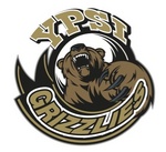
It's official: the Ypsilanti Grizzlies are born.

Official Grizzlies logo.
The images were finalized at Monday's unified Board of Education meeting and were formally unveiled in a press release issued after the meeting adjourned.
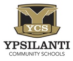
The district logo already has been appearing frequently on community-wide communications, web and social media sites, T-shirts, uniforms and banners. This logo was designed to embody the heritage of both communities and reflect a bold and confident future, district officials said.

Official YCS district logo.
The mascot, the Ypsi Grizzlies, was crafted as a strong, fierce figure — communicating a force to be reckoned with, district officials said in the news release. Students in the Willow Run and Ypsilanti school districts were given the final vote in the selection of the district's mascot.
Gail Nicklowitz of GN Communications designed the YCS district logo and Gerry Barnett of Lynn Graphics customized the Grizzly image.
Danielle Arndt covers K-12 education for AnnArbor.com. Follow her on Twitter @DanielleArndt or email her at daniellearndt@annarbor.com.


Comments
woohoo
Sat, Jun 22, 2013 : 4:03 a.m.
I am almost certain that when the students CHOSE this mascot they were not thinking about what is native in Michigan, because let's face it, it does not really matter. No one bashes Huron High School for being the 'river rats', let the kids make something that was pretty much forced upon them theirs. THEY chose this, THEY want this, and THEY are going to be attending this new school district. All of these negative comments are just opinions from alumnae that are angry about the merger.
YpsiGirl4Ever
Thu, Jun 20, 2013 : 3:53 p.m.
The kids did a good job here and the Logo Design is great!
LRF
Thu, Jun 20, 2013 : 4:22 a.m.
I didn't realize grizzly bears could fly. I also didn't know grizzly bears had any significance to the Ypsi area. A I have never seen a grizzly bear in Ypsi
LRF
Thu, Jun 20, 2013 : 4:16 a.m.
That is in my opinion and also the opinion of many others I have spoken to the worst possible choice of a logo and mascot ever! What the heck significance to the surrounding community does a grizzly have? Also please show me the B-24 wings that are supposedly incorporated into the design of the logo. Who ever designed this horrible logo did a child like job. Why not go with something more appropriate and significant like Brave flyers? A logo bearing the resemblance of a B-24 with a pilot in the cockpit would be so much better than this total abortion (excuse the choice of words) however it's hard to think of another more fitting way to describe it Another great choice would be something like Liberators with a Greek warrior like Demetrius Ypsilanti for whom the area was named. My goodness people what were you thinking? Or were you thinking?
woohoo
Sat, Jun 22, 2013 : 4:05 a.m.
It was actually the students. You're not going to school there, your opinion really doesn't matter.
sdenise
Wed, Jun 19, 2013 : 4:49 p.m.
The Grizzlies may indicate fierceness BUT they as a bear, they are not native to Michigan. Made more sense for UM to have chosen the Wolverines a totally native breed of animal. I think more of the Southwest for this type of bear, for Ypsi it seems like overkill.
sdenise
Wed, Jun 19, 2013 : 4:58 p.m.
The Tigers may have been named so because of their early wearing of orange and black stripped socks per Wikipedia.
sc8
Wed, Jun 19, 2013 : 2:39 a.m.
The "Grizzlies" logo looks like a bear that's trying to wipe its nose after sneezing the words "Ypsi Grizzlies".
Catbus
Wed, Jun 19, 2013 : 12:10 a.m.
The YCS logo looks great. The bear logo isn't bad - not a big fan of the tilty swirl text, but the bear part works for me.
grye
Tue, Jun 18, 2013 : 9:22 p.m.
What an insult to all bears. Are there no feelings left for how this will affect them psycologically? I can see bears having to attend therapy sessions to overcome the stigma associated with have a school identify with them as their mascot. The shame of it all.
djacks24
Tue, Jun 18, 2013 : 9:01 p.m.
Go Hurons!
a2citizen
Tue, Jun 18, 2013 : 9:01 p.m.
I was hoping the Heron would be the mascot.
yesisaidit
Tue, Jun 18, 2013 : 8:37 p.m.
Have they said were the high school will be?
Danielle Arndt
Wed, Jun 19, 2013 : 3:28 a.m.
yesisaidit, the high school will be at the current Ypsilanti High School. Here's a link to a previous story explaining the secondary building use: http://www.annarbor.com/news/ypsilanti/joint-board-of-education-votes-to-house-middle-schoolers-in-willow-run-high-schoolers-in-ypsilanti/
yesisaidit
Tue, Jun 18, 2013 : 8:42 p.m.
so they will be at ypsi high?
Basic Bob
Tue, Jun 18, 2013 : 8:40 p.m.
corner of packard and hewitt.
tom swift jr.
Tue, Jun 18, 2013 : 8:23 p.m.
I did not know that the wings on a B-24 had feathers.
jns131
Wed, Jun 19, 2013 : 7:54 p.m.
I guess it is to represent something lost. Fly like an eagle or a turkey. Which ever. Maybe some hidden message?
HONDO
Tue, Jun 18, 2013 : 7:46 p.m.
Oh thats it me and all the other " Country Bears" are deeply offended that the image of the grizzly is so violent and mean looking..... Are we "grizzlies" swiping at a Huron that is trying to put an arrow in us? Ridiculous thats the point. hehe
Forest City
Tue, Jun 18, 2013 : 7:13 p.m.
I think it will look good on a football helmet.
Forest City
Tue, Jun 18, 2013 : 7:12 p.m.
Kudos for not stealing the logo from a college or pro team.
EyeHeartA2
Tue, Jun 18, 2013 : 11:20 p.m.
Other than Oakland U, of course.
Rob Pollard
Tue, Jun 18, 2013 : 6:56 p.m.
I give the YCS logo an A -- it's not busy, easy to read, uses the colors well, and the wings are a nice touch. Very good job. I give the Bear logo a C or D. I like the Ypsi and Grizzlies part OK, but the bear looks like somebody stepped on his right paw, and he's yelling in pain. Plus, brown, gold and black aren't a great color combo.
djacks24
Tue, Jun 18, 2013 : 9:01 p.m.
I was kind of thinking along those lines. Averaging an A and C makes a B overall.
Faygo
Tue, Jun 18, 2013 : 6:42 p.m.
I like the YCS logo more than the grizzlies logo, it's just a little generic for my taste. Love the flyers wings on the Y.
jns131
Wed, Jun 19, 2013 : 7:53 p.m.
Agreed. Love the Y.
SonnyDog09
Tue, Jun 18, 2013 : 6:29 p.m.
There are no grizzly bears in Michigan.
jns131
Wed, Jun 19, 2013 : 7:53 p.m.
There are no golden bears either and that is Slausons logo.
Gretchen Ridenour
Wed, Jun 19, 2013 : 3:07 p.m.
But I haven't seen any lions ot tigers roaming around in Detroit either!
Kyle Austin
Tue, Jun 18, 2013 : 10:48 p.m.
I think I remember a story a little while back about there being no more known wolverines in the state
pete
Tue, Jun 18, 2013 : 10:23 p.m.
Fred Zollner (the founder of the Ft. Wayne Pistons) owned a piston factory, and named his team after that.
treetowncartel
Tue, Jun 18, 2013 : 9:51 p.m.
They were the Fort Wayne Pistons before moving to Detroit.
musicnerdsftw
Tue, Jun 18, 2013 : 9:34 p.m.
For the record Elaine, "Red wings" I believe refers to the flames that come out of an open v8 engine on a muscle car. Pistons is also a car reference. Make sense for Detroit teams
Elaine F. Owsley
Tue, Jun 18, 2013 : 8:27 p.m.
So what! There are no lions, tigers, Spartans or their descendants, pistons don't walk around, red wings are probably birds. I think there are river rats and a couple of wolverines, but reality isn't what this is about.
Ignatz
Tue, Jun 18, 2013 : 6:56 p.m.
There are several Grizzlies that can be seen at 10 Mile and Woodward.
tdw
Tue, Jun 18, 2013 : 6:51 p.m.
I'm talking about the animal
tdw
Tue, Jun 18, 2013 : 6:36 p.m.
There's no wolverines ( for the most part ) in Michigan either
TryingToBeObjective
Tue, Jun 18, 2013 : 6:26 p.m.
Curious why those who voted "C, D, or E"- was it because of the design, or because you wanted a different mascot to start with, or because you're still annoyed with the consolidation? Just asking. I think the logo is pretty good, as a non- Ypsi parent.
TryingToBeObjective
Tue, Jun 18, 2013 : 9:20 p.m.
Thanks dotdash.
dotdash
Tue, Jun 18, 2013 : 8:34 p.m.
I voted a C. I think either one is fine, but the Grizzlies and the official logo are so different as to be truly weird together. It's as if they were each developed by different committees who didn't talk to one another. Different type faces, different feeling -- the color is about the only thing that unites them. The grizzly logo says danger, spirit, movement, energy. The wings logo says tradition, stability, calm. Marketing 101: unified presentation of the brand. Or maybe the brand was never defined clearly?
Hmm
Tue, Jun 18, 2013 : 6:19 p.m.
Looks pretty snazzy to me
WalkingJoe
Tue, Jun 18, 2013 : 6:19 p.m.
Glad they let the kids decide and it sounds like they did a good job.
Usual Suspect
Tue, Jun 18, 2013 : 5:52 p.m.
OK, that looks decent. I'm pleasantly surprised.
StrongFire
Wed, Jun 19, 2013 : 10:15 p.m.
jns131 I don't know about you, but if I see a grizzly bear looking like that I would definitely be concerned for my life. :-)
jns131
Wed, Jun 19, 2013 : 7:52 p.m.
I like the Y logo but that bear looks like he is in pain.