Small addition improves home's function in a big way
I have frequently said that homes built in the 1950s were usually very well built.
Some marketing folks are now referring to this era of homes as “mid century,” which make them sound more grand than they are. These homes are ideal to update because of the quality of construction.
PROBLEM

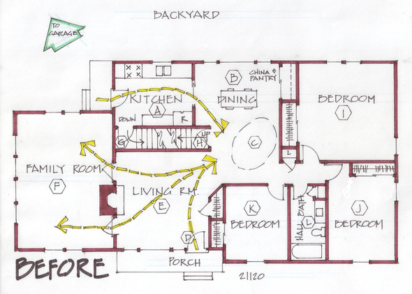
Incidental entries and bad traffic patterns were the primary problems that drove these homeowners crazy. Next, the closed in kitchen (A) isolated the cook except when people were passing thorough. There were no amenities near the back door that would be considered useful for a family entry.
The dining room (B) was quite pleasant yet had some questionable “nowhere space” (C). Incoming stuff such as coats, backpacks and mail regularly gets dumped on the dining table.
The front entry (D) opens abruptly into the traffic-laden living room (E). The furniture possibilities are quite limited in the living room.
A strange, large family room (F) is accessed off the living room. I think this room might have been a porch, since it is a step down and the proportion is out of concert with the rest of the house.
A centrally located staircase accesses the basement (G) on one end, and an unfinished attic (H) on the other.
Three bedrooms (I, J, K), descending in size, complete the floor plan, with the only bath (L) in the middle.
The homeowners asked for an open kitchen with an inviting way out to the backyard. They wanted to improve the front entry (D) and to create some sort of family entry.
Their plan was to claim attic space to create a master suite and extra lounge space.
This couple has a home-based business, and one of them runs the business from home. They did not want to squeeze into one of the bedrooms, because that rarely feels professional. A home office should be near the pulse of the home, including the kitchen and laundry. Presently the laundry is located in the unfinished basement, and they would like to change that.
SOLUTION

An addition was in order, but not a large one. I designed it with utilizing the new space upstairs as well. We made some dramatic changes here, but the results are stunning.
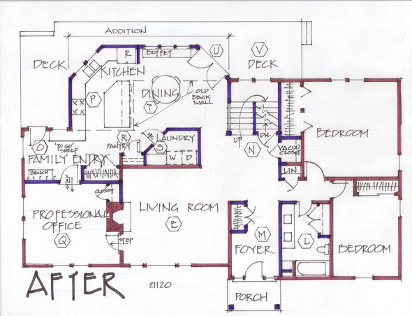
To improve the living room (E), we took the front door out of that space and created a foyer (M) out of bedroom (K) and gave two feet to the bathroom (L).
We removed the old stairwell, and created a new, open staircase (N) in part of the dining room.
A family entry (O) is carved out of part of the family room (F). The floor is leveled so that it is a smooth transition into the new kitchen (P). The balance of the family room is used for the professional office (Q)
The kitchen (P) is built in the addition with angles for interest. The eat-on island is a perfect surface for incoming groceries. An efficient closet style pantry (R) is right next to a main floor laundry (S).
The dining space (T) is a great place to sit. French doors on an angle (U) invite people out onto a new deck (V)
There is no comparison of the remodeled house to what it once was. The homeowners are delighted and plan their new upstairs as phase two.
Marcia Lyon is a professional remodeling designer and freelance writer, producing projects locally and several other areas across the U.S. and Canada. Her new book on remodeling design, “The Essential Planner for Home Remodeling,” is available at www.creatingspaces.net. You may contact her at Marcia@creatingspaces.net or at 515-991-8880 to set up a consultation.

