Contemporary Ann Arbor Hills home bucks tradition

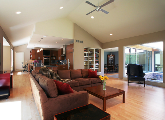
OPEN SPACES: The open living room sits at the back of the house, overlooking a courtyard with a Zen garden, Chinese maple tree and a fire pit.
Photos courtesy of Angelini & Associates Architects
Instead of placing the private spaces - the master bedroom, sitting room and powder room - in the rear of the house, they brought them front and center.
This allowed them to position the public areas - the great room, the kitchen and the dining room - in the back of the house, around a three-sided, 17-by-15-foot courtyard, maximizing light and bringing nature into these living spaces. Inside the courtyard, separated from the outside by walls of glass, sits a Zen garden with a Chinese maple tree and a fire pit made by Frey.


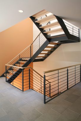
CENTERPIECE: The modern metal and maple staircase reaches frome basement to the second floor and allows a strong shaft of light to come through the core of the house.
“We wanted to make it as light as possible so it didn’t block views,” Bradford Angelini said. That meant having open risers, having no posts and using steel painted in a subtle blue/grey.
“It’s as if it floats,” said Theresa Angelini. The wall adjacent to the staircase is painted with faint lines, adding to the horizontal image.

“The staircase was one challenge,” Bradford Angelini said. “We wanted to make it absolutely simple so everything flows continuously.”
But they also had to pay attention to city codes for stairways.
In the beginning

When Frey bought a dated flat-roofed ranch with a leaky roof a number of years ago, he knew he was in for a major renovation or something even more drastic. “I bought it for the location,” Frey said.
He painted the walls and put up wallpaper and lived in the house for five years, all the time thinking about his next step. By 2005, he knew he wanted to start from scratch.
“It turned out I wanted a custom house, so I could put my own touches on it,” Frey said.

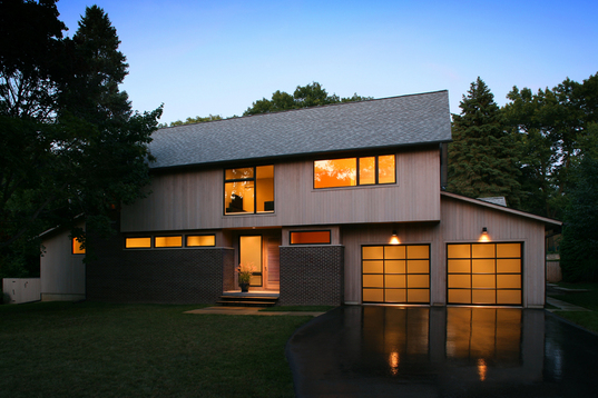
The blond cedar and brick façade house has a geometric front created by horizontal and square windows, multi-paned glass garage doors at one end and a large square window sitting on the other end like a punctuation mark.
“We wanted to maximize the light and the views,” Bradford Angelini said.
Frey was looking for a unique, modern house with clean lines but a subdued feel. He wanted contemporary, but something with more warmth than modern, perfected by architect Ludwig Miews van der Rohe who defined stark spaces with glass and steel. “We wanted to soften it,” said Theresa Angelini. Soft lighting was key.
The spaces are separate but connected. The kitchen, with its over-sized island, opens up to the great room, with a fireplace centered in the room but off-centered in the slate that surrounds it.

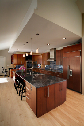
In the kitchen, natural maple floors with their fine grain offer contrast to the mocha-stained maple cabinetry and smoky blue pearl granite countertops.
The natural maple kitchen floors with their fine grain offer contrast to the mocha-stained maple cabinetry and smoky blue pearl granite countertops. The blue glass tiles of the backsplash pick up the blues in the granite. The geometric lines of the kitchen ceiling add variety.

The house design also had to accommodate some family heirlooms, such as a corner cabinet. The house has few corners, but one was added in the dining room to make space for the piece.
Placing the master bedroom in the front of the house came with the challenge of making it private, Bradford Angelini said. That meant windows high in the walls for privacy in the first-floor powder room and master suite, a design that also had the illusion of making the second floor appear to float above the first floor when looking from the outside.
Between the entrance and the master suite is the sitting room, a space meant for quiet (there’s no television here) but also to create distance between the front hallway and the bedroom.


Comments
AAJoker
Thu, Jan 21, 2010 : 12:09 p.m.
Wow, bought the house originally in '02 for $289,000 only to tear it down and build a house now assessed at $797,800! Taxes alone are $1,500 a month... I like the design, but I can't grasp the cost.
walker101
Thu, Jan 21, 2010 : 10:25 a.m.
I bet the heating bill costs more than most house payments, now if he can only park it in the West Coast it would it wouldn't be so bad.