United Bank and Trust unveils new slogan and logo, with Chief Tecumseh missing
As United Bank and Trust has branched out from Tecumseh, the logo featuring the town's namesake chief has held less and less meaning for their clients, marketing director Jamie Guise said. Guise was behind the rollout of a new logo and color for the company that began Sept. 17.

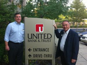
Robert Chapman, CEO, and Todd Clark show off a sign with the bank's new logo
Photo courtesy United Bank and Trust Facebook page
The bank was established in 1893, and has expanded to 17 branches in Lenawee, Livingston, Monroe and Washtenaw counties. That expansion into previously untapped markets was a major factor in the decision to change the logo.
“We have offices all over now, and the connection to the chief was just not as strong,” Guise said.
“We decided it was time to take a look at what our mission and vision was and come up with a new logo that embraced both our heritage and the future for the bank.”
In developing the new look the bank changed the hue of its burgundy color to more of a red. The new, brighter color was chosen to attract attention but not confuse current clients.
“The intention was not to throw everything out and start over,” Guise said.
“We kept a similar color scheme on purpose. Going from burgundy to red is an evolution, going from burgundy to blue would have been starting over.”
The strong performance of UBAT in the last year would indicate that the bank does not have a need for a complete makeover. The bank has grown its assets by $22.4 million in the past year to $884 million while adding 17 new employees, according to the latest FDIC report published June 30.
Guise also considered the new logo an evolution. The box that used to hold the profile of the iconic chief now has two curved corners, and instead of the man in the headdress, the letter “U” appears in white in the bottom right corner of the design. Guise said the “U” was meant both to identify United Bank and, quite literally, “you.”
“We’re talking about ‘you’ the client, ‘you’ the community, and ‘you’ the co-worker,” she said. “It gives us unity around our community bank footprint and our methodology.”
Guise said the company has gotten positive feedback both from longtime customers in Lenawee county as well as in the markets UBAT is expanding to across the southeast corner of the state. Along with the new logo, the company is beginning a 24-month advertising campaign around the new tagline “Solutions Together.”
Ben Freed covers business for AnnArbor.com. Reach him at 734-623-2528 or email him at benfreed@annarbor.com. Follow him on twitter @BFreedinA2


Comments
Dexter Bear
Tue, Oct 2, 2012 : 1:24 p.m.
When I first saw it, I thought it was a hanging microphone, then it looked like a stand mixer. I have to really look to see the U. And I have young eyes... It's attention getting, though, that's for sure.
Frank Lee
Tue, Oct 2, 2012 : 1:11 p.m.
Chief Tecumseh has a typo in the poll. If UBT is going to drop the chief from their logo, their color should at least be THS orange. Red already has a bad wrap in the banking industry and is also associated with that college in Ohio.
Dog Guy
Tue, Oct 2, 2012 : 12:57 p.m.
Only in this centennial year of the War of 1812 did those bankers realize that Tecumseh fought against the USA, so he had to go from the logo. Also, only this year did those bankers learn when the War of 1812 was fought. Non-local bankers give Tecumseh no respect.
Lance Holland
Tue, Oct 2, 2012 : 12:14 p.m.
Miss the Chief! Don't forget your Tecumseh roots please.
dading dont delete me bro
Tue, Oct 2, 2012 : 10:31 a.m.
i see U there white U, but what exactly is the field of red representing besides rounded corners? diver down?