Ann Arbor's Design Review Board critiques 2 14-story developments proposed for downtown

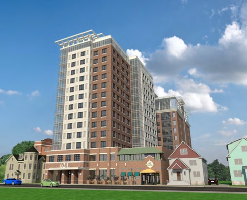
A rendering shows the proposed 14-story project that would be built next to and over the existing Pizza House restaurant on Church Street.
J Bradley Moore & Associates
The developments follow a recent trend of high-rise construction in the downtown area, and if built, the projects would bring hundreds of beds to the student rental market.
The seven-member review board discussed the developments for more than two hours on Wednesday afternoon, during which they posed questions to the development teams and offered suggestions related to the downtown design guidelines.
A meeting with the board is required by city ordinance, but implementation of its suggestions is voluntary.
Pizza House development
The first project — a 14-story, 83-unit, 181-bed building on Church Street — was met with some praise for its adherence to the design guidelines.
“From my own behalf, I think you’ve responded pretty well,” said board member Chet Hill, principal at Johnson Hill Land Ethics Studio.
He added: “There are some things that could be addressed, obviously. It looks like a twin of some of the other (projects) here in town pretty much.”
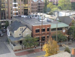
Proposed by Pizza House owner Dennis Tice and Minnesota-based Opus Group, the project would be built next to and over a portion of the existing Pizza House restaurant at 618 and 624 Church St. Plans call to demolish the existing two-story residential structure on the site south of the existing restaurant.

Plans call to demolish the house next to Pizza House and replace it with a high-rise apartment building.
City of Ann Arbor
The building, which would have one and two bedroom units and a rooftop plaza, would be 140 or 150 feet tall. By right, the maximum building height is 150 feet. It would have an amenity floor, which could include a gym, lounge area and leasing center.
To provide the required amount of parking, the developer reached an agreement earlier this month to lease 42 offsite parking spaces from Ann Arbor’s Downtown Development Authority.
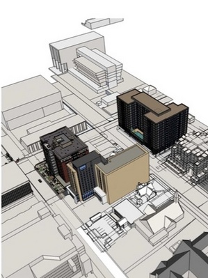
The project abuts Zaragon Place high-rise, which is on East University Street, and is located two blocks west of the 14-story Landmark development. It’s adjacent to a property management office and near student rental homes.
“It’s a very eclectic area,” project architect Brad Moore told the board. “It’s an area that’s viewed as being in transition…it’s a change in perception to students as to how they want to live.”
The architectural vision, Moore said: “Break up the mass by articulating the surfaces and by treating those surfaces with a variety of building materials and colors.”
Board member Mary Jukuri, a landscape architect with SmithGroupJJR, expressed concern about the use of precast concrete and panels, and asked if it would be possible to incorporate some brick into the design — something Moore said could be a construction safety issue with the restaurant below.
“Whatever you can do with texture changes, scale elements, artwork — anything to enhance the pedestrian experience along Church Street would fit in with (design guidelines) well,” added board member Richard Mitchell, owner of Mitchell and Mouat Architects.
Among the other suggestions: incorporating some height variation into the building, changing the paving materials in front of the Pizza House entrance to distinguish it from the apartment building, encouraging green roofing aspects and providing a through-block connection from Church Street to East University.
East Huron Street development
The second project, a 14-story, 213-unit high-rise on the corner of East Huron and North Division streets, drew more questions and criticism from the board. About two dozen community members listened in on the 90-minute discussion.
“We’re very excited about the project and we’re excited to be in Ann Arbor,” Conor McNally, chief development officer at Georgia-based developer Carter, told the board.

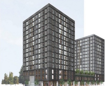
A rendering of the proposed development for 401 and 413 East Huron Street in downtown Ann Arbor
Humphreys & Partners Architects

A rendering shows the proposed East Huron Street development, located across the street from Sterling 411 Lofts and the under-construction The Varsity project
Humphreys & Partners Architects
The project would replace a vacant, 10,300-square-foot building, a house and a former Papa John’s pizza store, which closed in September in preparation for the development. Connecticut-based real estate firm Greenfield Partners purchased the properties and is partnering with Carter to lead the development. The project architect is Humphreys and Partners Architects, and Ace Hotel is acting as a design consultant.
Mostly mum about the project until now, the development team explained the project vision to the board on Wednesday.
“(This is) very important to us. It’s a large investment — a $60 million project…it needs to be something that stands the test of time,” McNally said.
“I think, realizing how the zoning is on the street and the new construction that is being planned in this area, we really wanted to try to be, frankly, kind of brave, and do something that looked different” added Eric Cheong of Ace Hotel.
Plans include 163 below-grade parking spaces and 14 surface parking spaces. It would have ground-floor retail space with large windows. The goal is to have a first-floor coffee shop and some type of rotating food kiosk. Other plans include an outdoor courtyard on the third floor with a pool, a fitness center, a business lounge and a yoga studio.
“We really felt like we had to create something that would really draw in pedestrian traffic and draw in people,” Cheong said. “We think the retail we want to program on the bottom floor is going to be important for the community and residents as well.”
Some major concerns from the board referenced the building’s overall size and lack of setback from the street.
“This building needs a setback,” Jukuri said. “That being said, I wouldn’t want to see this building picked up and pushed toward the neighborhood (to the north). I feel like the building is really crowding the corner.”
Tamara Burns of HopkinsBurns Design Studio added: “I just think that the massing, it does not respond to the context. You’ve got a historic neighborhood and all these buildings pulled back along Huron Street, and this doesn’t represent either of those.”
The development would be adjacent to Sloan Plaza Condominiums and would abut two historic residential homes to the north — a concern that elicited an emotional response from residents and neighborhood association leaders after the meeting.
“I do not want a 14-story massive wall in my backyard,” neighbor Norman Tyler told the developers. ”I call this a student warehouse.”
The board emphasized that the corner is prominent for Ann Arbor’s downtown, and acts as a main “artery” through the city. The corner, the board said, should have a signature building.
Some board members were concerned with the dark feel of the building, stemming from the black-glazed brick material. But architect Mitchell complimented the developers on the materials used, calling it a “really rich palette.”

Images of the exterior materials that would be used on the East Huron Street development
Humphreys & Partners Architects
“There’s a very deliberate aesthetic,” developer McNally said in response to the concerns. “We don’t want to lose that; that’s very important to us, but we will think carefully about what we can do.” The developers said the brick material is important because they try to use sustainable and organic building materials.
The board also suggested the developer rethink plans for an outdoor pool, since it could only be utilized a few months during the summer. Board member Bill Kinley of Phoenix Contractors said retail on the first-floor might not be viable.
“I can’t think of any space on Huron that there’s any retail…I’d suggest taking a little time while you’re in town…walk up and down to experience the traffic here. You don’t see many pedestrians on that sidewalk,” he said.
Other suggestions included differentiating the corner of the building, improving the pedestrian experience, addressing pedestrian safety concerns, possibly relocating the entrance to the building and minimizing the shading to adjacent properties.
After the meeting, McNally told AnnArbor.com that he received some constructive feedback from the board and planned to meet with his team to discuss possible design changes moving forward.
There will be a citizens participation meeting for the project before it goes before Ann Arbor’s Planning Commission and City Council.
Lizzy Alfs is a business reporter for AnnArbor.com. Reach her at 734-623-2584 or email her at lizzyalfs@annarbor.com. Follow her on Twitter at http://twitter.com/lizzyalfs.


Comments
BobbyJohn
Mon, Oct 22, 2012 : 7:56 p.m.
Lizzy Some of the people on the design review board are not even Ann Arbor residents. Do you know how that is possible? Makes no sense to me.
snapshot
Fri, Oct 19, 2012 : 5:21 a.m.
This board is full of themselves and want to incorporate their own egos into the design. Maybe they ought to concentrate on accommodating a new property tax base. Maybe pedestrians will start waking around the developments if they allow them to build rather than nit pick, alienate, and discourage developers with their ego feeding opinions. This board is bad for business, very bad for business.
rusty shackelford
Thu, Oct 18, 2012 : 5:18 p.m.
Whoever did that second rendition for Humphreys should be canned. Making your project look like the Death Star is generally frowned upon.
Linda Peck
Thu, Oct 18, 2012 : 3:42 p.m.
One small factoid that was of interest to me was that the E. Huron building is estimated to cost 5 million dollars LESS than what the proposed new downtown library would cost. Think about it voters. I don't like 14-story buildings because of the deep shade and wind tunnel effects they bring, and also 14-story libraries would make me dizzy.
Wolf's Bane
Thu, Oct 18, 2012 : 2:53 p.m.
As Brad Moore stated: "It's a very eclectic area." So, why ruin it with these monsters? Why homogenize the entire neighborhood just so the city and developers can line their pockets with a few bucks? Clearly, somebody's values and morals can be purchased just a bit to easily for my taste. If I hear one more thing from the Historic District Commission, I will scream. These guys are useless.
Vivienne Armentrout
Thu, Oct 18, 2012 : 2:51 p.m.
This (north) side of Huron should have been zoned D2. It is shameful that it was zoned even a scaled-down D1.
Ron Granger
Thu, Oct 18, 2012 : 2:33 p.m.
The DDA needs to stop selling our parking infrastructure to private development corporations, particularly for "dorms" and other non-business ventures. That parking will arguably need to be replaced by taxpayers. With the cost of finding new scarce sites for parking structures, etc, I question whether taxpayers are getting the shaft. I don't believe the DDA's mission is to build parking infrastructure and flip it to real estate developers.
foobar417
Thu, Oct 18, 2012 : 3:40 p.m.
Assuming the full costs are being reimbursed, what's the problem? It's better than putting a parking garage into the ground floor of every building, with all the attendant curb cuts. --Eric
Joel M. Batterman
Thu, Oct 18, 2012 : 1:28 p.m.
Retail and pedestrian traffic on Huron is something of a chicken-and-egg issue. Certainly the road is hostile to pedestrians. But it seems to me that a primary reason there's no pedestrian traffic on Huron right now, in contrast to Liberty, is that there isn't any retail to direct it there right now. Tios seemed to do fine on Huron before their old place got demolished for parking.
CalmDown
Thu, Oct 18, 2012 : 3:42 p.m.
I found it interesting that the design board warned developers that retail might not work because of the limited pedestrian traffic but still asked the developers for changes to make the site more pedestrian friendly. Some useful retail is far more friendly than a big empty setback.
Lizzy Alfs
Thu, Oct 18, 2012 : 2:35 p.m.
Interesting point. I think that's what the developers were trying to convey - they recognize there is no retail on Huron Street, but they are hoping that by including retail in their project, the street will become a draw.
foobar417
Thu, Oct 18, 2012 : 2:30 p.m.
I agree. That comment from the Design board was unfortunate. Huron is a wasteland currently. That won't change until developers start building retail shops on it. Widening the sidewalks and shrinking the road would help improve the pedestrian experience as well, but seems unlikely.
15crown00
Thu, Oct 18, 2012 : 1:03 p.m.
42 parking spots for an 84 unit building?what have i missed?
GoNavy
Thu, Oct 18, 2012 : 2:45 p.m.
If you can blow $1500 a month on your kid's housing "needs," then you're probably one of those parents who can afford to send your kid off to school in a brand new BMW. Gotta park those things somewhere....
Lizzy Alfs
Thu, Oct 18, 2012 : 2:34 p.m.
@15crown00: the city requires a certain amount of parking spaces for any new development. I'm not sure the exact requirements, though. I can find it for you.
Veracity
Thu, Oct 18, 2012 : 12:56 p.m.
Both buildings will alter the appearance and character of Ann Arbor's downtown that will not be entirely evident until they are built. Furthermore, considering the recently completed and ongoing student high-rise apartment buildings, these additional speculative student rentals may challenge the demand for luxury student rentals. Although many student families apparently can afford upwards of $1000 monthly leasing rate, the number of these well-to-do students is not unlimited. A wise approach would be to delay building these two 14-story projects until existing construction of similarly sized buildings are completed and fully leased. The demand for expensive student housing may wain with the new rentals, making future student high-rise investment less likely to be financially successful.
steven
Thu, Oct 18, 2012 : 1:12 p.m.
15crows00 - UM students tend to have wealthy parents. The few remaining middle class and working class students live along Ellsworth and Washtenaw in Pittsfield.
15crown00
Thu, Oct 18, 2012 : 1:05 p.m.
tell me again,how are students supposed to afford these apartments?
steven
Thu, Oct 18, 2012 : 12:51 p.m.
The Huron Street project looks pretty nice to me. It's unique, and there's a clear attention to detail. Church Street building, on the other hand, looks generic and ugly.
steven
Thu, Oct 18, 2012 : 5:02 p.m.
Ann Arbor doesn't have too many high rise buildings, and the ones it does don't look nice. Personally, I'm not in favor of either of these buildings, but I particularly don't like how generic the Church Street building looks. Buildings like it can be found in almost any mid-sized city, and, as you point out, throughout Ann Arbor.
GoNavy
Thu, Oct 18, 2012 : 2:44 p.m.
The Church Street building looks like exactly 40% of the high rise buildings currently in Ann Arbor.
Arboriginal
Thu, Oct 18, 2012 : 12:45 p.m.
The Huron building looks great. What did the board have to say about the glass prison like structure at the corner of 5th & Huron? The least friendly building in town. The new building fits in and will change the "character" of the neighborhood no more than the other two enormous structures on that block of Huron, Sloan Plaza and the Campus Inn.
Brad
Thu, Oct 18, 2012 : 4:06 p.m.
"compared their design to the building at Huron and Fifth" I bet that got a good laugh.
Lizzy Alfs
Thu, Oct 18, 2012 : 2:31 p.m.
Actually, @Arboriginal, interesting you should ask! The developers of the East Huron and Division street building compared their design to the building at Huron and Fifth.
Nerak
Thu, Oct 18, 2012 : 12:29 p.m.
It looks like a hulking prison. I'm all for a tall building on this corner, but it should have grace and beauty, balconies for residents, and a wow-factor to vastly improve the pedestrian experience along this bleak sidewalk. The project as presented needs a huge amount of work, in my opinion.
aa1940
Thu, Oct 18, 2012 : 12:11 p.m.
Slum tenement of the future
GoNavy
Thu, Oct 18, 2012 : 2:43 p.m.
Tyler - I hear you. However, keep in mind that the "slum-like" conditions exhibited by many houses/dwellings in AA are the result of a two-way interaction. True, landlords are concerned with making money while limiting expenditures. Their motivation to spend vast sums to keep places looking "beautiful" is minimal. On the other hand, students are like locusts. They are rarely paying for their own living arrangements, and thus treat housing like another consumable good. It's the students who destroy the houses; that the landlord doesn't want to throw good money towards keeping a place "nice" for a student isn't strange. These high rises might become the "slum tenements of the future," but it won't be because of the landlords alone.
Tyler
Thu, Oct 18, 2012 : 12:49 p.m.
Have you seen the houses students live in now? Former 3 bed 1 bath houses converted to 7 bed 1 bath. THOSE are slums. The new proposals look far better than many of the current housing options.
David Frye
Thu, Oct 18, 2012 : 12:02 p.m.
The proposed Huron building looks like an office building in a suburb of Mordor.
Wolf's Bane
Thu, Oct 18, 2012 : 2:53 p.m.
This is probably the best metaphor I've heard all day. Thank you for the laugh!
LAEL
Thu, Oct 18, 2012 : 11:33 a.m.
The Huron project seems to dark and hulking to me. Maybe in a city block filled with tall buildings the black material would be a refreshing change from the more common cement and red or beige brick colors, but in the rendering here it looks like a big dark squatting lump. Very unappealing. And it's to the south of those neighborhoods so the sun will be creating a dark lump of a shadow to go with the big dark lump of a building from that side view. Could the mass of black be broken up a bit with another material or color (i.e. like the other project did) to give it some lightness to the feel?
PersonX
Thu, Oct 18, 2012 : 1:19 p.m.
Start all over again with a better design
Lizzy Alfs
Thu, Oct 18, 2012 : 12:05 p.m.
Well said, @LAEL. Some of the board members echoed those sentiments, and also asked the developers if they could incorporate some other materials or colors.